

The yellow LBank B icon rising behind a glowing yellow horizon, with its base hidden by the sunrise amid charcoal-grey clouds and black space.

LBANK

One brand. A wider orbit.

Digital experiences, campaigns and cultural connections for a brand built around discovery.

LBank

Clarity for the product.
Character for the brand.

A digital brand lives in many places: the first visit, the daily interface, the shared celebration and the moments that connect it to culture. This body of LBank work brings those encounters into a recognisable visual world.

Structured layouts make complex content easier to navigate. Expressive characters, a distinctive yellow signal and campaign systems bring personality to the experience. Together, the work connects practical product design with a broader sense of community.

Different experiences.
One unmistakable energy.

From the interface to the campaign, a shared visual language gives every interaction a clear place in the LBank world.

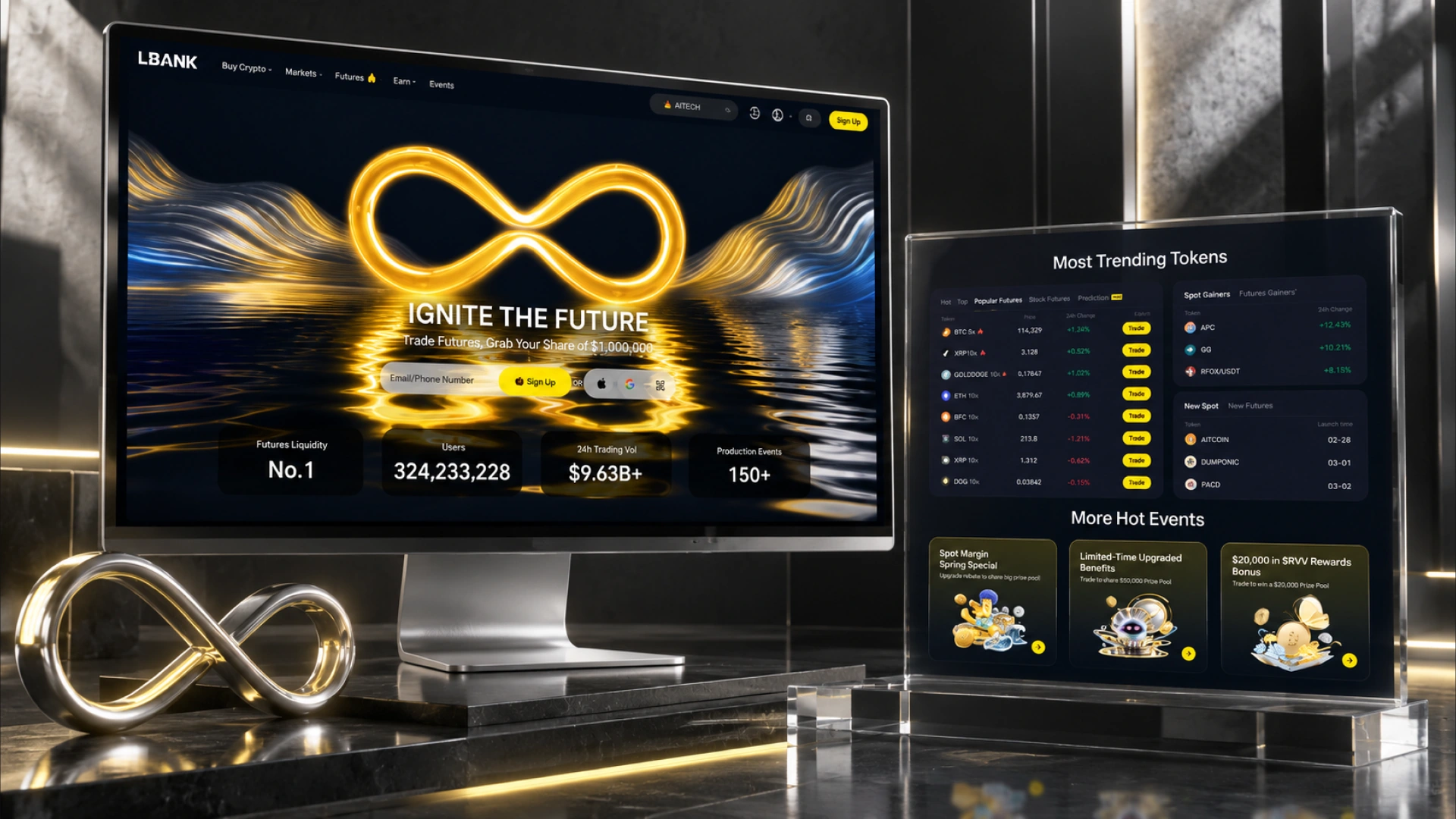
LBank homepage and trading content displayed on two screens in a charcoal studio with glass plinths and a metallic infinity symbol.

A clearer way
to explore.

The homepage redesign organises markets, products and community content into a clear visual hierarchy. A striking opening image establishes the brand, while consistent cards and yellow action cues guide attention through a dense digital experience.
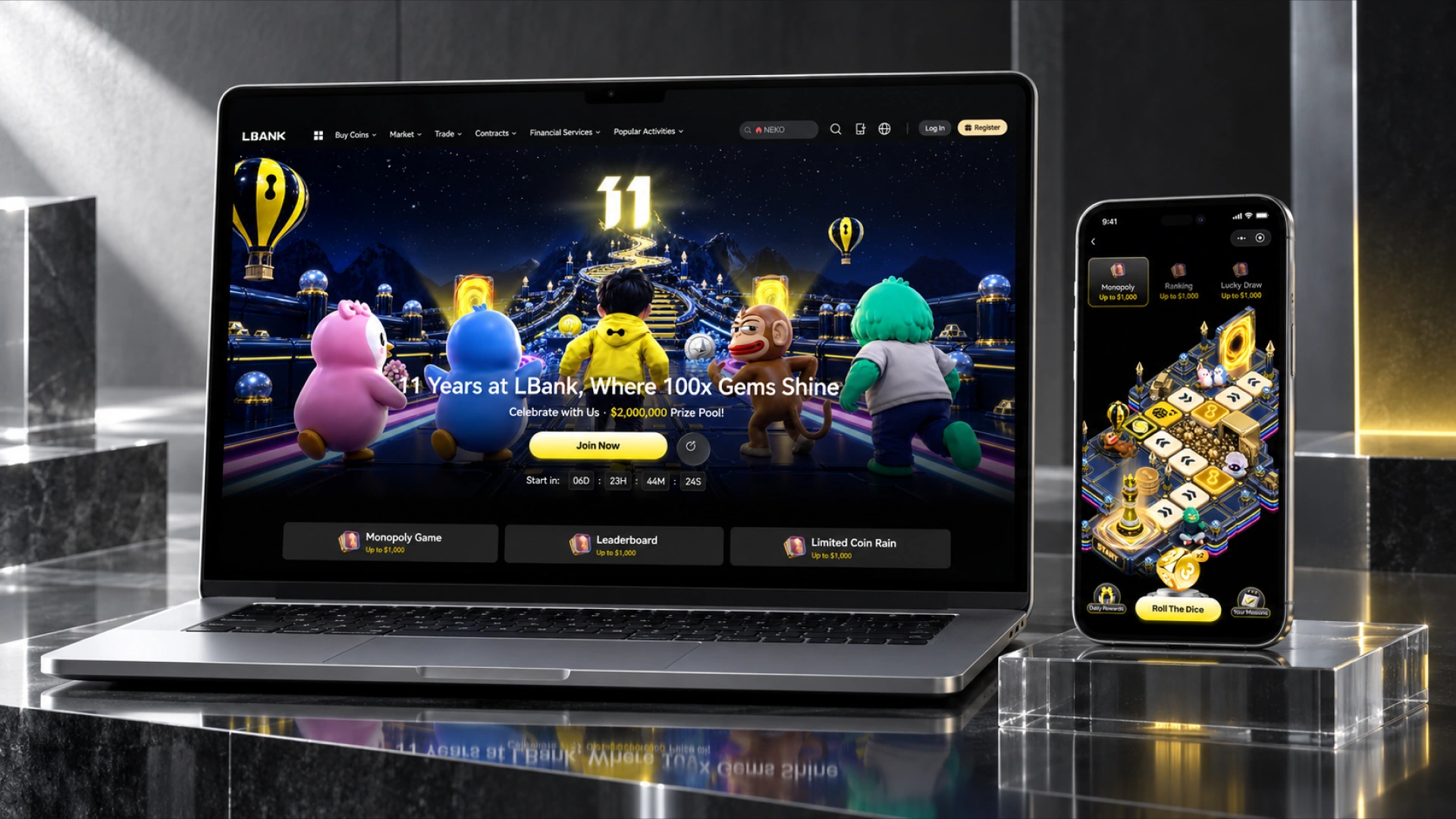
LBank anniversary campaign shown on a silver laptop and a phone above clear glass plinths.

A milestone made
into a world.

The anniversary campaign turns a celebration into an explorable visual journey. Characters, luminous pathways and a game-inspired interface connect the desktop story with the mobile experience, giving the campaign a distinctive sense of anticipation.

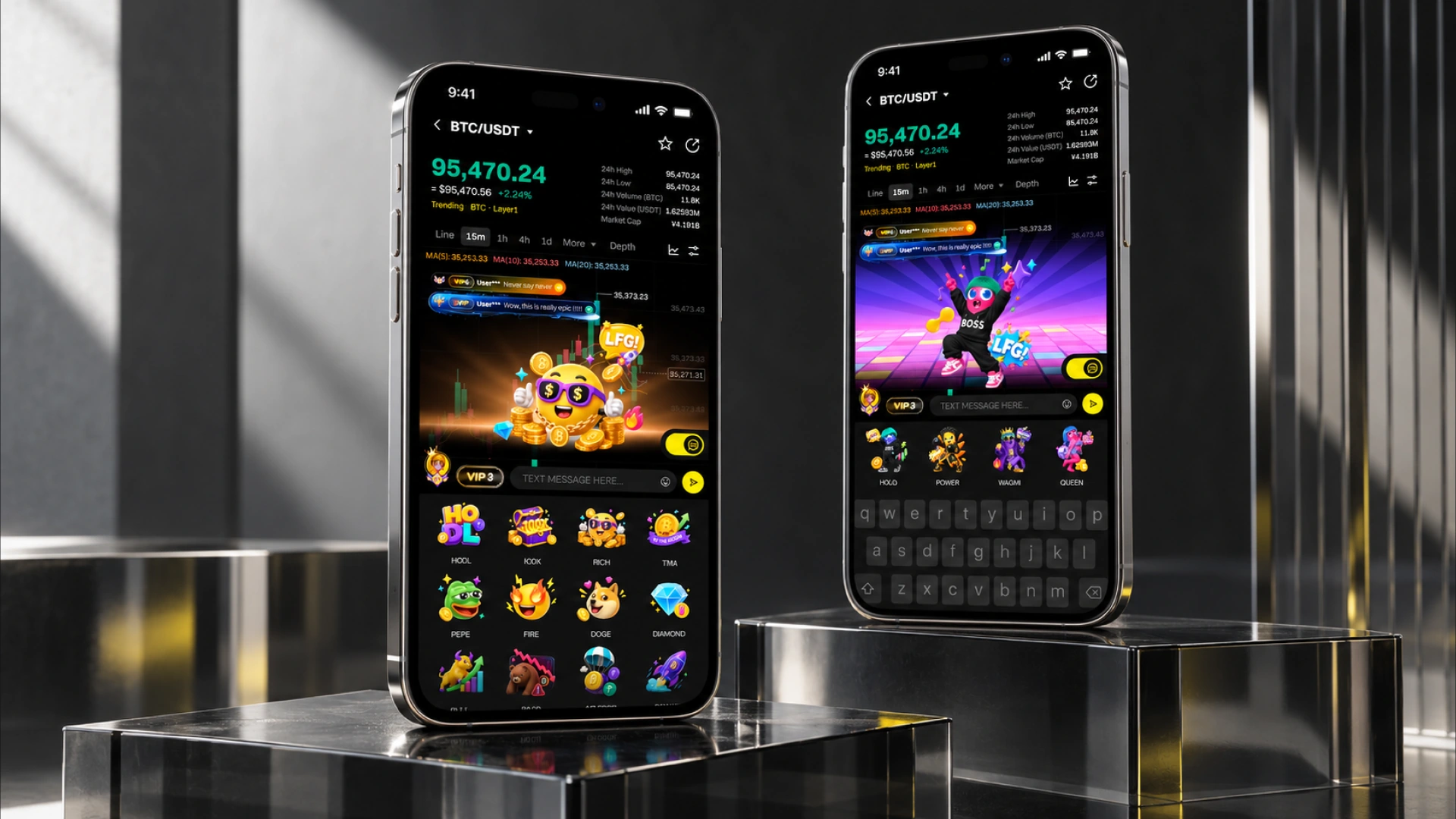
Two phones displaying LBank trading, community messaging and expressive character features in a glass and metal studio.

Personality inside
the product.

Messaging features introduce expression into a data-heavy interface. Animated character concepts, reactions and sticker systems give the community a visual voice, while a familiar interface keeps the experience coherent and easy to follow.

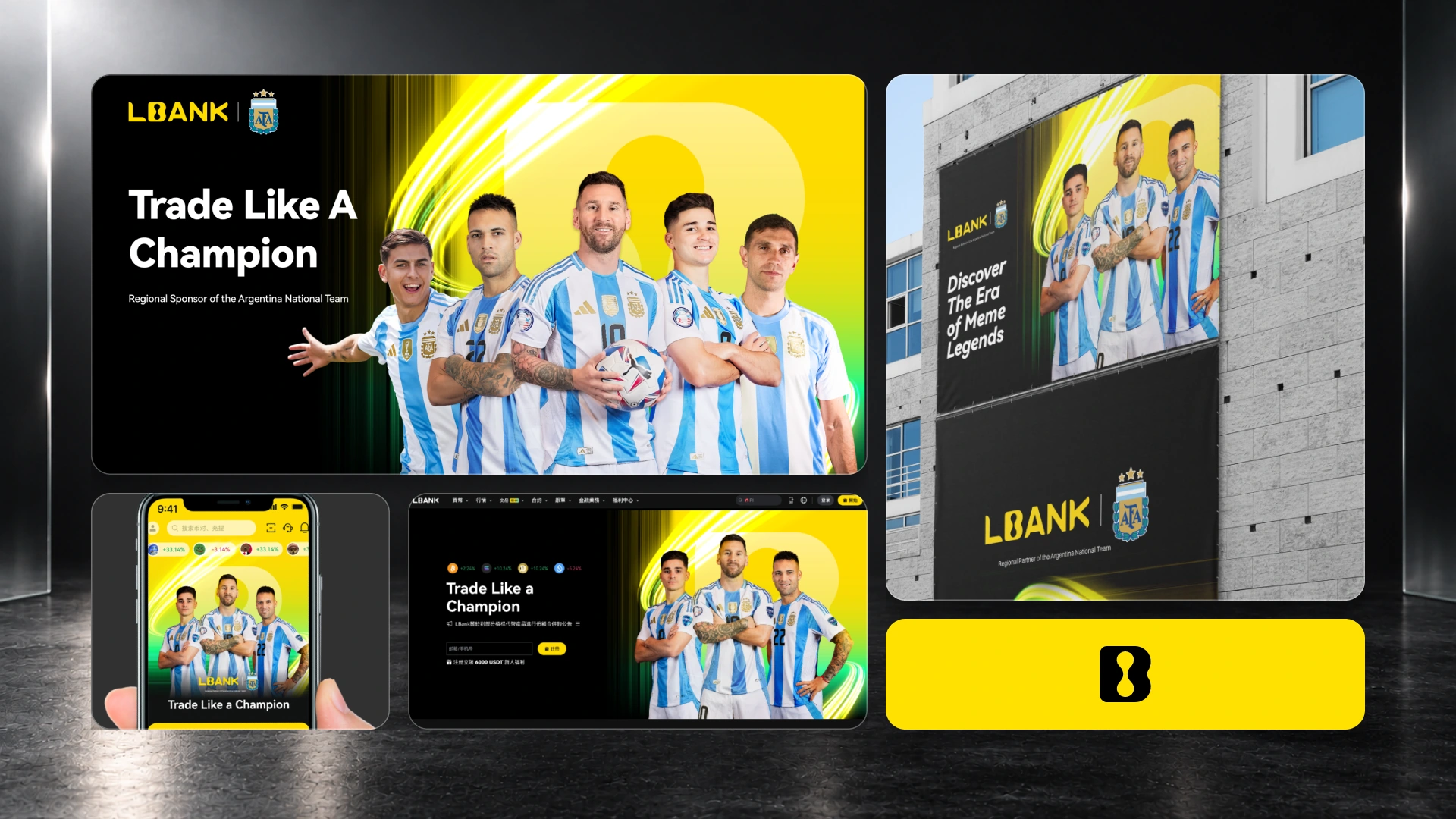
LBank and Argentina football partnership artwork arranged as rounded campaign, mobile, website and outdoor panels on a charcoal background.

Shared passion.
Distinctive presence.

The AFA announcement work brings football imagery into LBank's visual language. Yellow, black and the team's blue-and-white palette create a recognisable campaign that carries a consistent message across digital and large-format touchpoints.

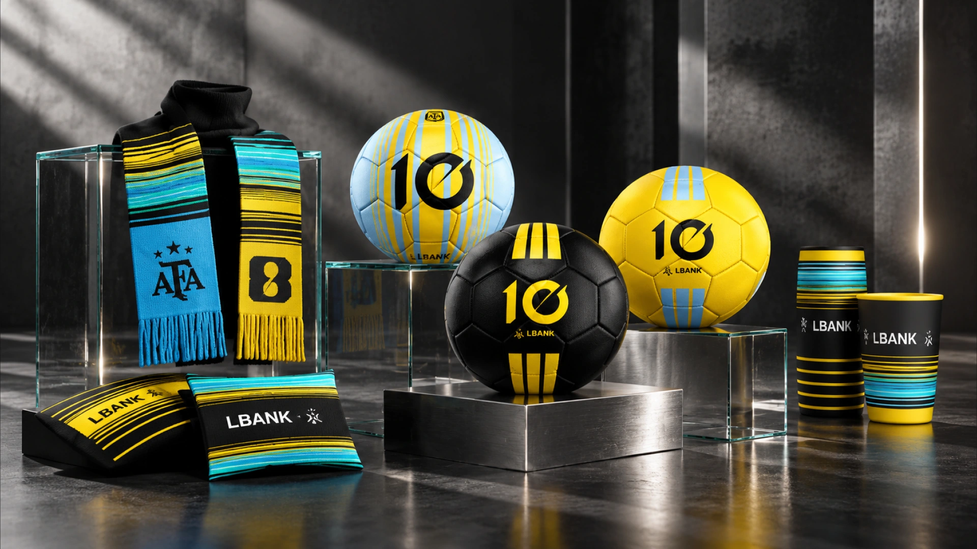
Concept LBank partnership scarves, drinkware and footballs arranged on glass and metal platforms.

A connection
you can hold.

Partnership concepts extend the visual system into scarves, drinkware and footballs. Shared colour bands and recognisable symbols translate the campaign into tactile objects, exploring how a digital brand can become part of a fan's everyday world.

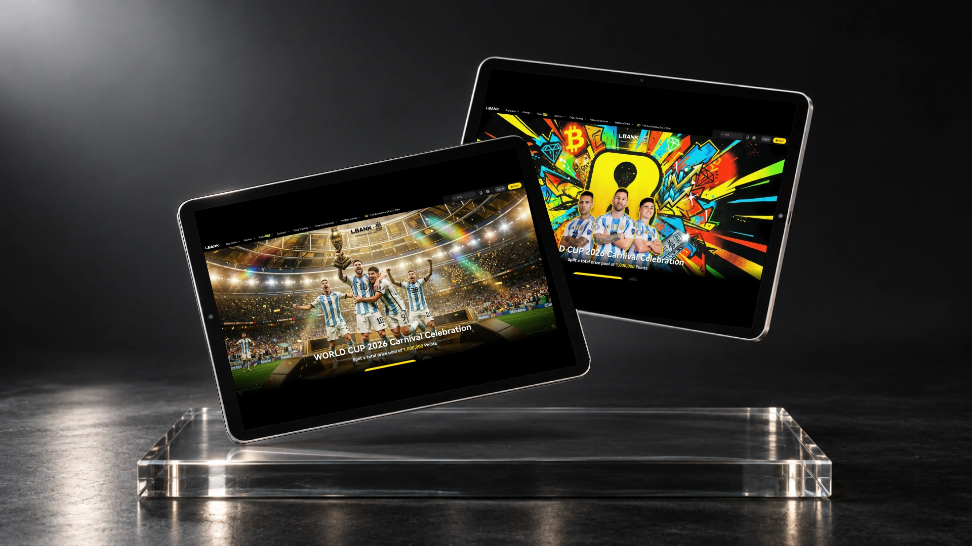
Two floating iPads presenting contrasting LBank football event concepts above an optical glass plinth.

Campaign energy.
A reason to explore.

Event concepts explore contrasting expressions of the same brand: polished black-and-gold compositions and bold, graphic football worlds. A clear interface connects the visual spectacle to the experience, giving each direction structure as well as character.

01 / 06

Next project

Gate.io

Have something in mind?

Start a conversation