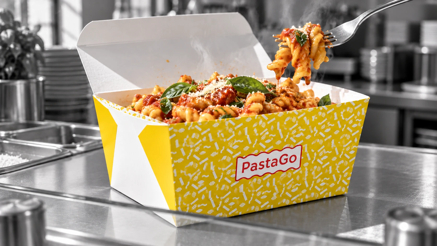
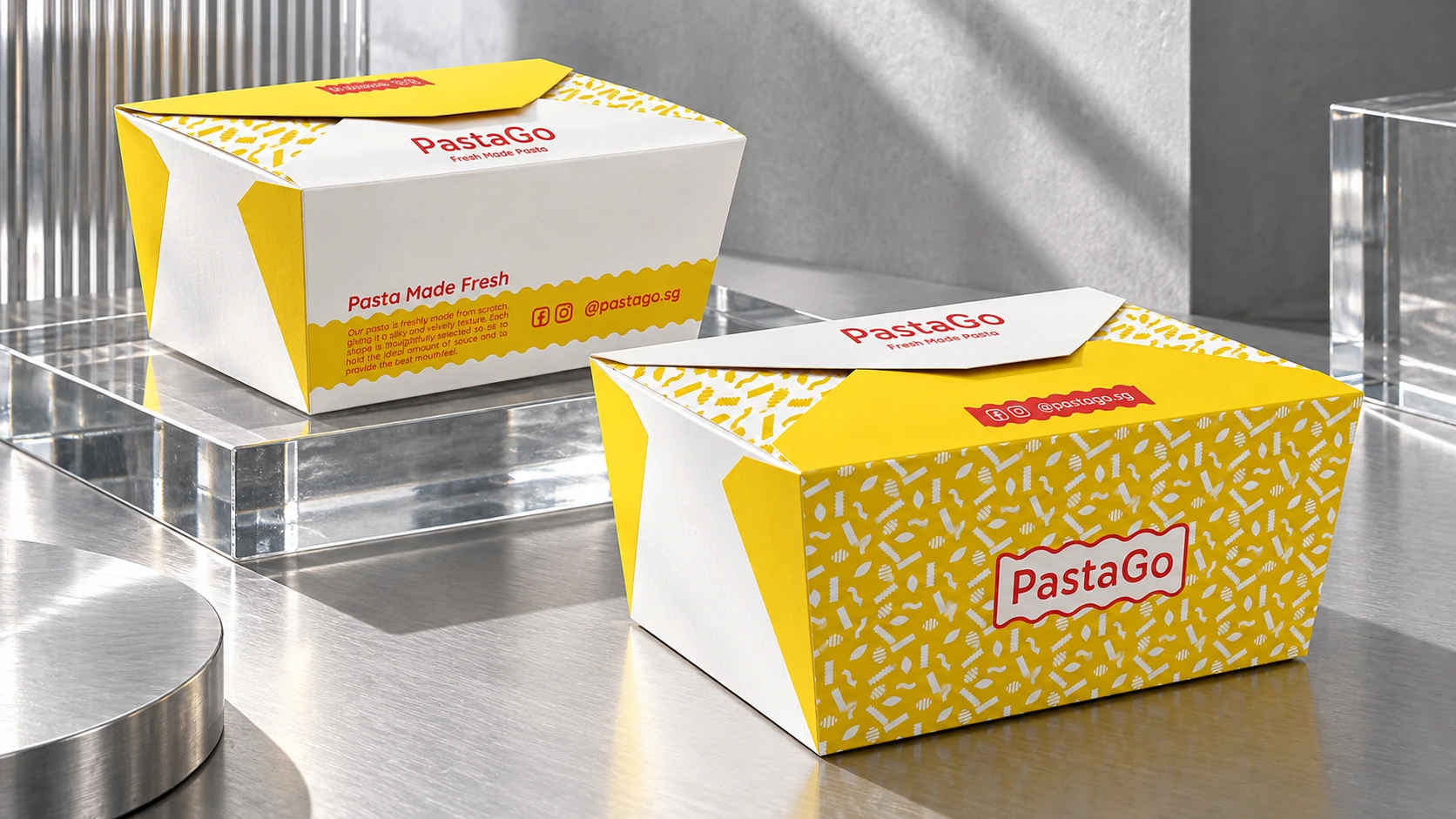
Fresh pasta in a yellow PastaGo takeaway carton on a monochrome stainless-steel kitchen counter.

PastaGo

Fresh pasta. Ready to go.

Branding, packaging, website and marketing for a pasta concept made for life on the go.

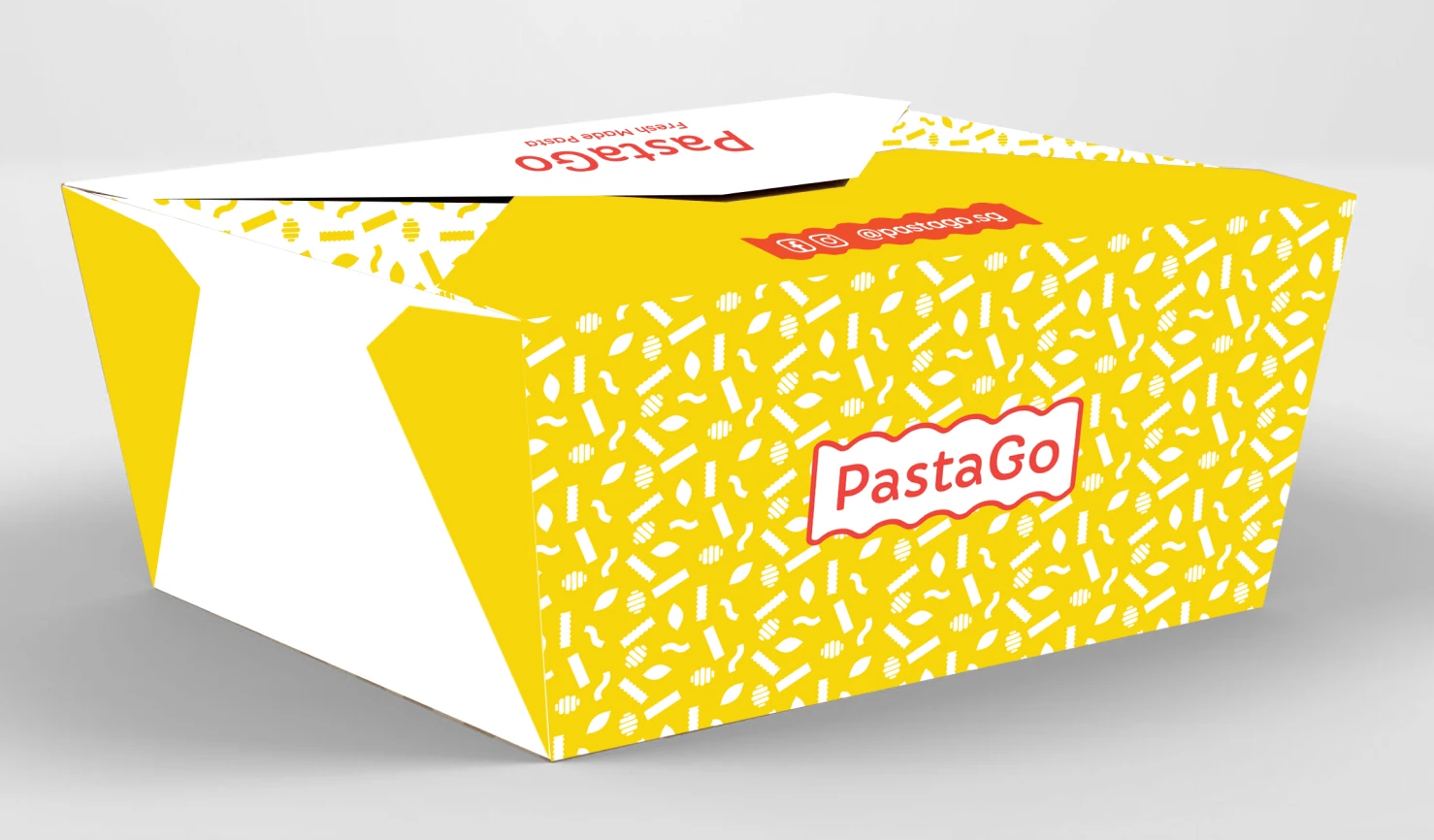
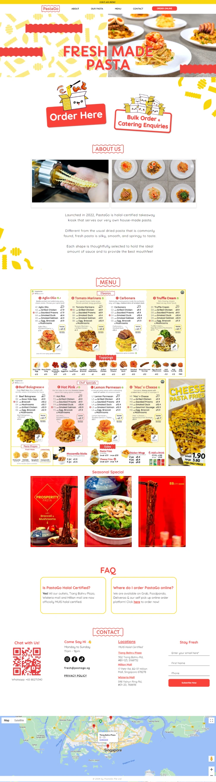
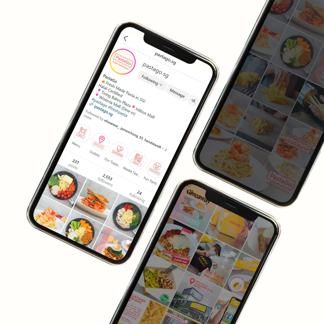
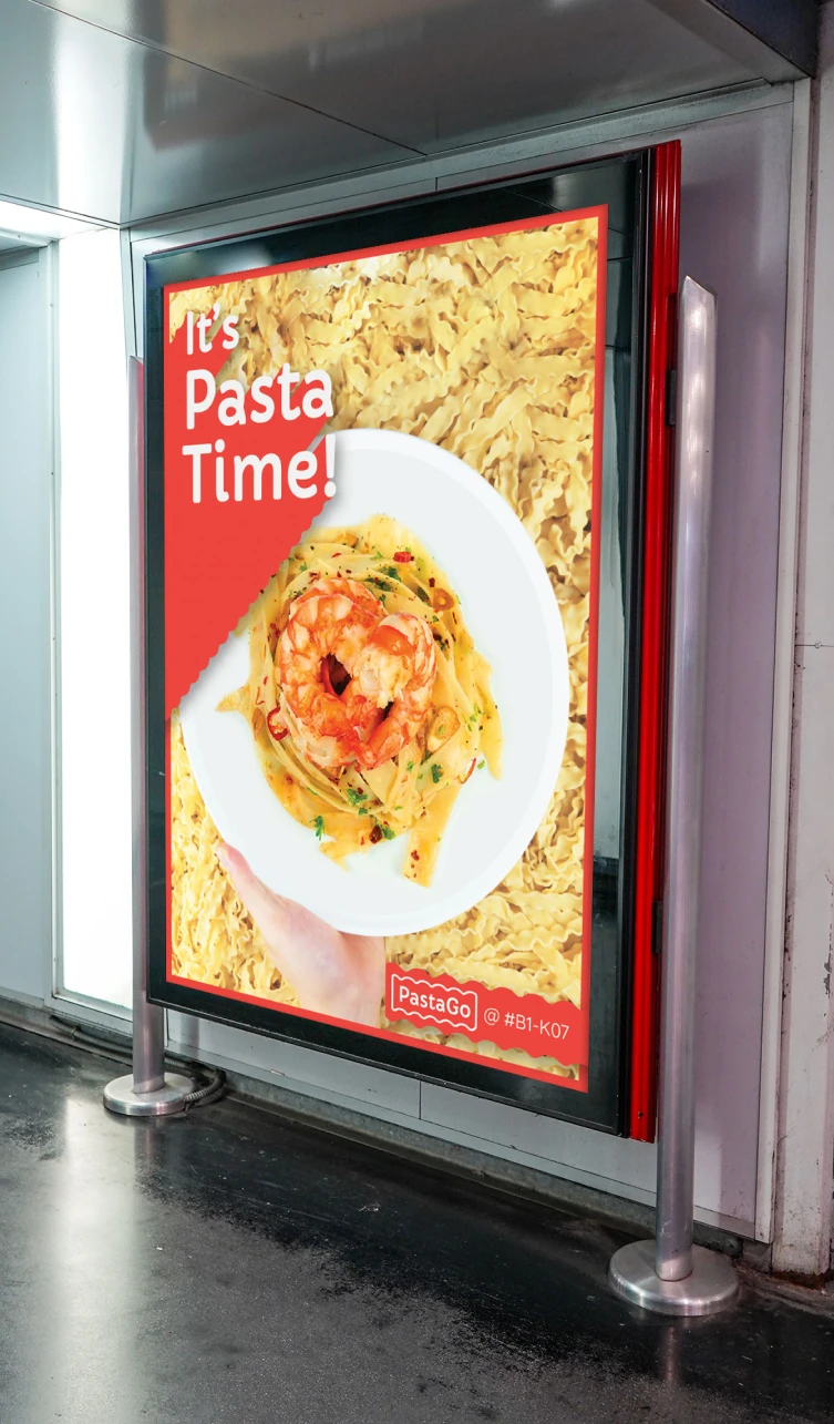
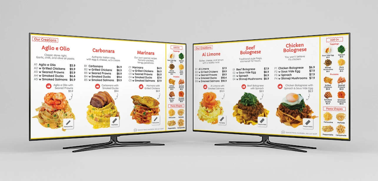
The red PastaGo wordmark with its Fresh Made Pasta tagline. Yellow PastaGo takeaway carton with a white pasta pattern. Full PastaGo website design with food imagery, ordering sections and menu content. PastaGo social content displayed across three phones. PastaGo food campaign poster in an outdoor display. PastaGo menu boards with dish photography and product categories.

Freshly made.
Made recognisable.

Zepto shaped PastaGo’s identity across branding, takeaway packaging, its website and offline marketing materials. The work brings the character of a quick, convenient pasta concept into each part of the customer experience.

Yellow, red and playful pasta graphics create a recognisable visual system. Food photography leads the appetite appeal, while menus, packaging and digital layouts make room for the practical details of choosing a meal.

One identity.
From screen to takeaway.

A bright, food-led design system carries PastaGo across its packaging, digital presence and in-store communications.

Two yellow and white PastaGo takeaway cartons on glass and brushed-metal display plinths.

A little character
with every takeaway.

Pasta-shaped patterns and the red wordmark turn the yellow carton into a recognisable part of the brand. The packaging carries PastaGo’s identity from the collection counter into the customer’s day.
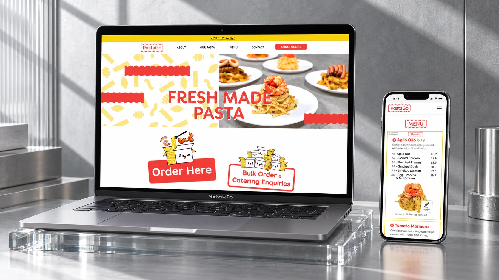
A laptop and phone displaying the colourful PastaGo website on a monochrome glass and metal set.

Put the food
at the centre.

Bold food imagery, warm colours and clear sections translate the identity into a digital experience. The layout introduces the menu and gives ordering information a prominent place on desktop and mobile.

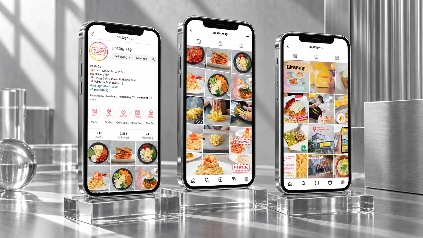
Three phones presenting PastaGo social content on glass stands in strong natural daylight.

Keep the appetite
going.

Food photography and a consistent use of colour connect individual posts to the wider identity. The content gives dishes, announcements and everyday brand moments a shared visual rhythm.

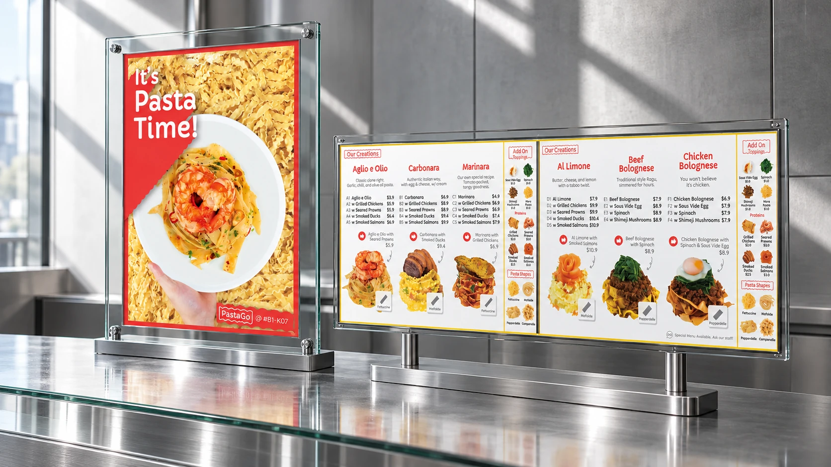
A PastaGo campaign poster alongside a wide food menu, displayed in glass panels.

Make the choice
look inviting.

Posters draw attention to the food, while menu layouts organise the range into clear categories. Shared typography and colour link the immediate impact of a campaign with the detail needed at the point of choice.

01 / 04

Next project

CWT Globelink Group

Have something in mind?

Start a conversation