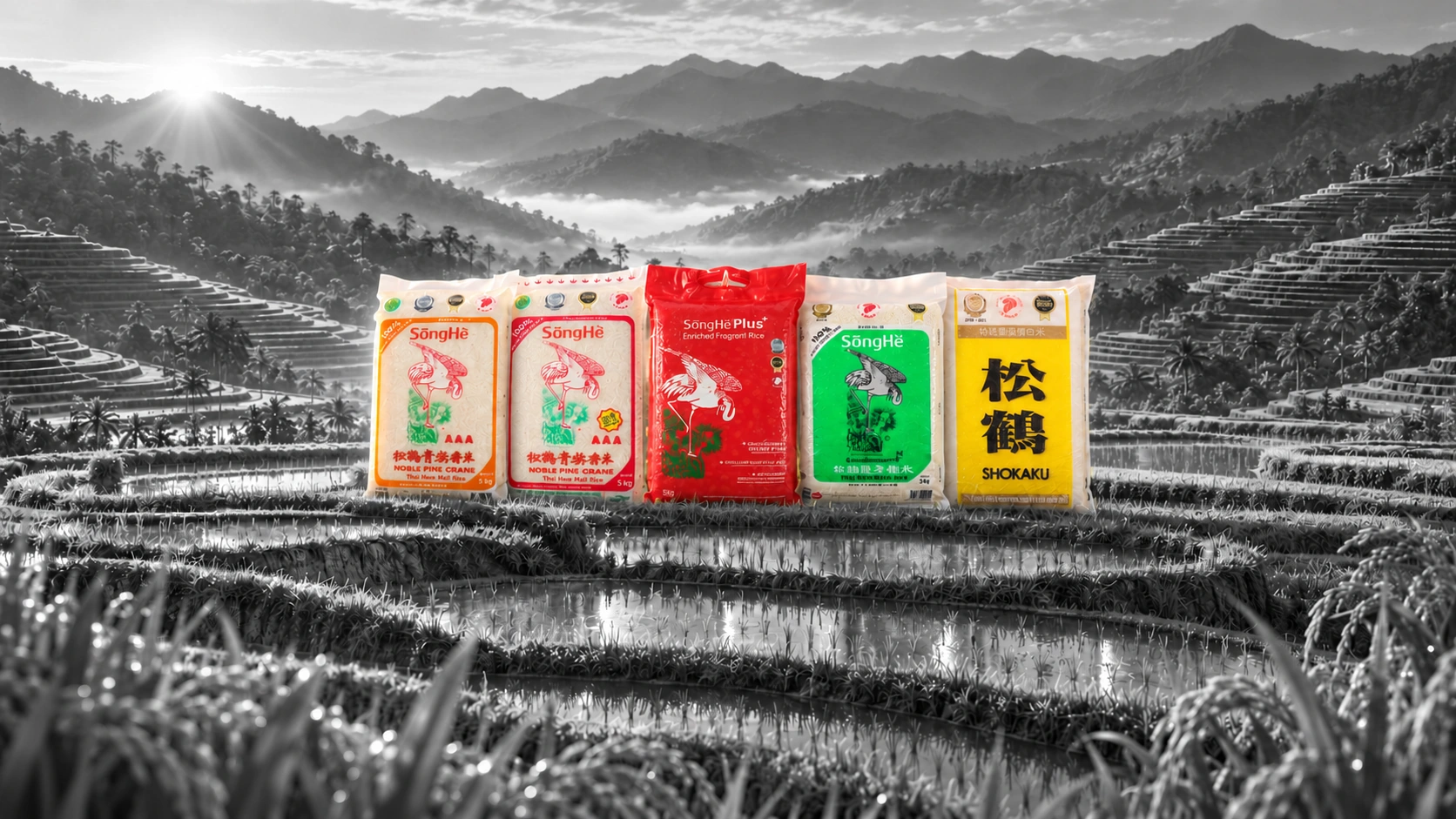

Five colourful rice packs, with the red SongHe Plus bag in the centre, standing among monochrome rice terraces and misty mountains.

Tong Seng Produce

Goodness in every grain.

An everyday essential, expressed with care. Packaging, campaigns and spaces for a familiar name at the table.

SōngHè

Rooted in care.
Made for everyday life.

Tong Seng Produce began with rice in 1990. Its SōngHè brand connects the quality of an everyday staple with the shared meals, relationships and memories around it.

Design carries that everyday connection across packaging, campaigns, digital stories and shared spaces. Clear product cues and a consistent visual language express quality and care at each point of contact, while giving individual brands room to speak in their own voice.

Everyday essentials.
Designed to connect.

From the shelf to the spaces where people meet, design gives everyday care a recognisable form. Familiar colours, clear messages and welcoming details connect the product to the people who choose it.

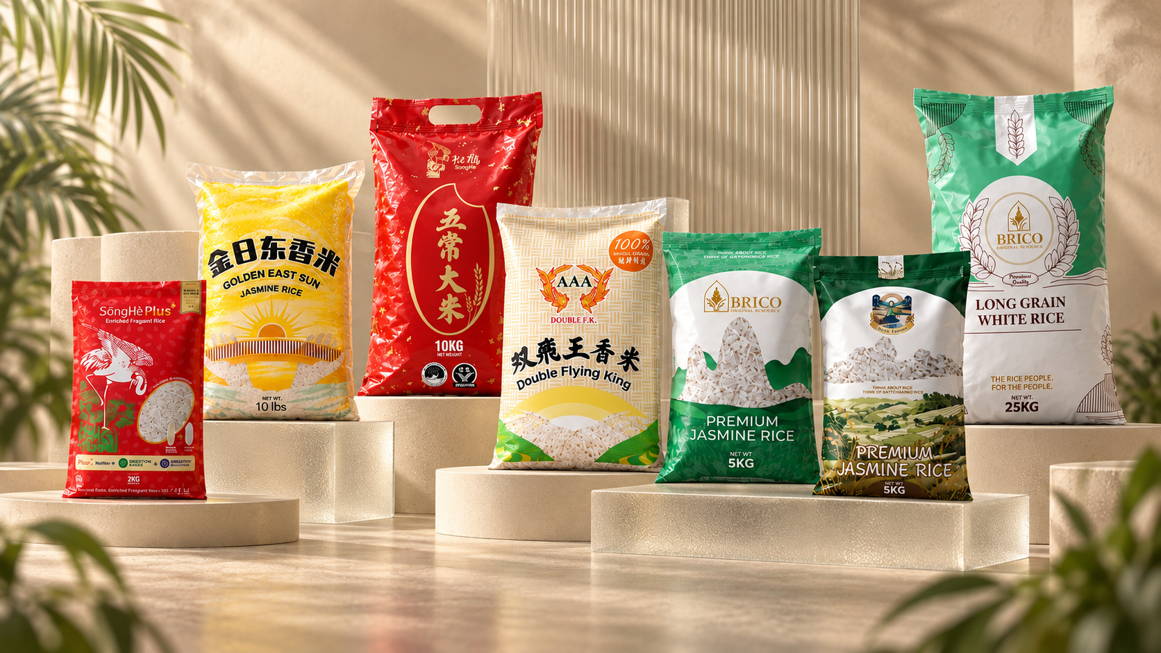
Tong Seng Produce rice packaging arranged on cream stone and translucent glass plinths in warm natural sunlight.

Choice made clear.
Quality made familiar.

Distinct colours and clear product names help each rice variety find its place on the shelf. Familiar brand cues and thoughtful details make the range easier to navigate, expressing care through an everyday choice.
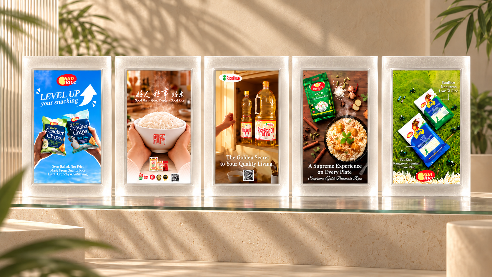
Product campaign posters aligned front-on in frosted glass frames, lit by warm sunlight and soft leaf shadows.

Clear stories.
Everyday relevance.

Product benefits become relatable stories through food, colour and a clear visual hierarchy. Each campaign keeps its own personality while making the connection between quality ingredients and daily life easy to understand.

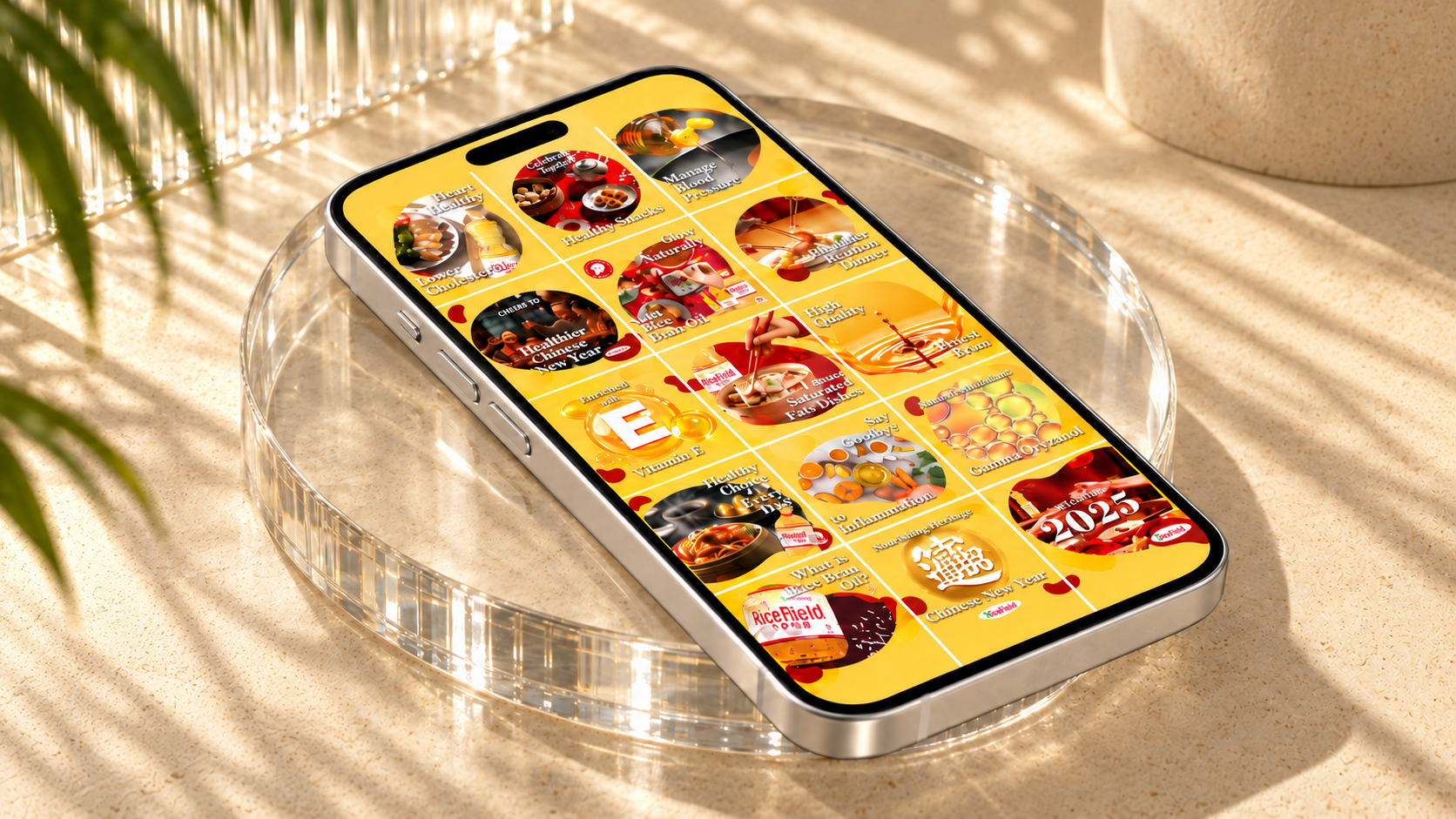
RiceField social artwork displayed on a single diagonal silver phone over a clear glass platform in golden natural light.

A familiar voice
in everyday moments.

RiceField’s warm yellow palette and consistent compositions bring recipes, celebrations and product stories into one recognisable presence. The design gives each post a clear role while keeping the brand close to everyday cooking and shared meals.

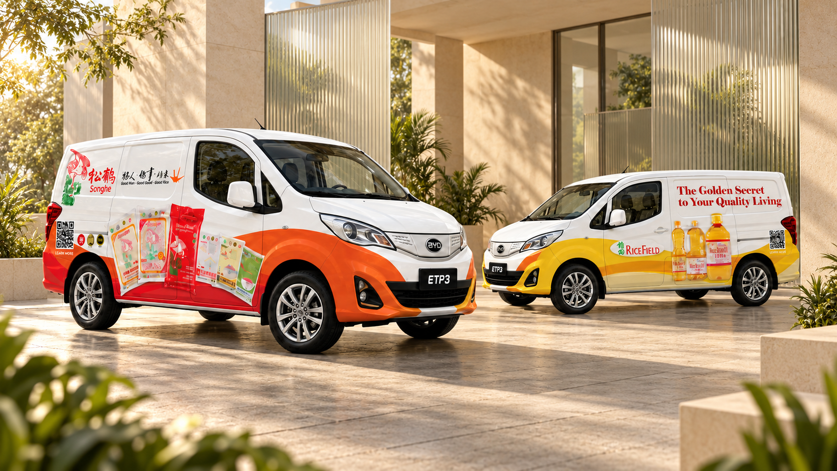
SongHe and RiceField branded vans in a warm sunlit courtyard with stone and glass architecture.

Recognition that
travels with the brand.

Bold colour, recognisable packaging and concise messages carry SongHe and RiceField beyond the shelf. Graphics shaped around each vehicle make the identity easy to read, giving everyday journeys a familiar brand presence.

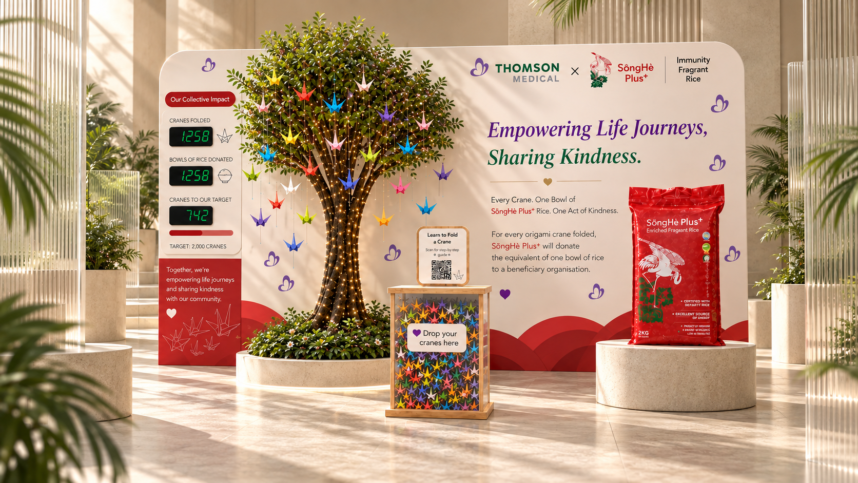
SongHe Plus and Thomson Medical concept display with an origami-crane tree, product presentation and warm sunlit glass surroundings.

Shared care,
made tangible.

The SongHe Plus concept brings nourishment and kindness into a shared space. An origami-crane installation invites participation, while clear product storytelling connects the experience to the brand’s care for people and their everyday wellbeing.

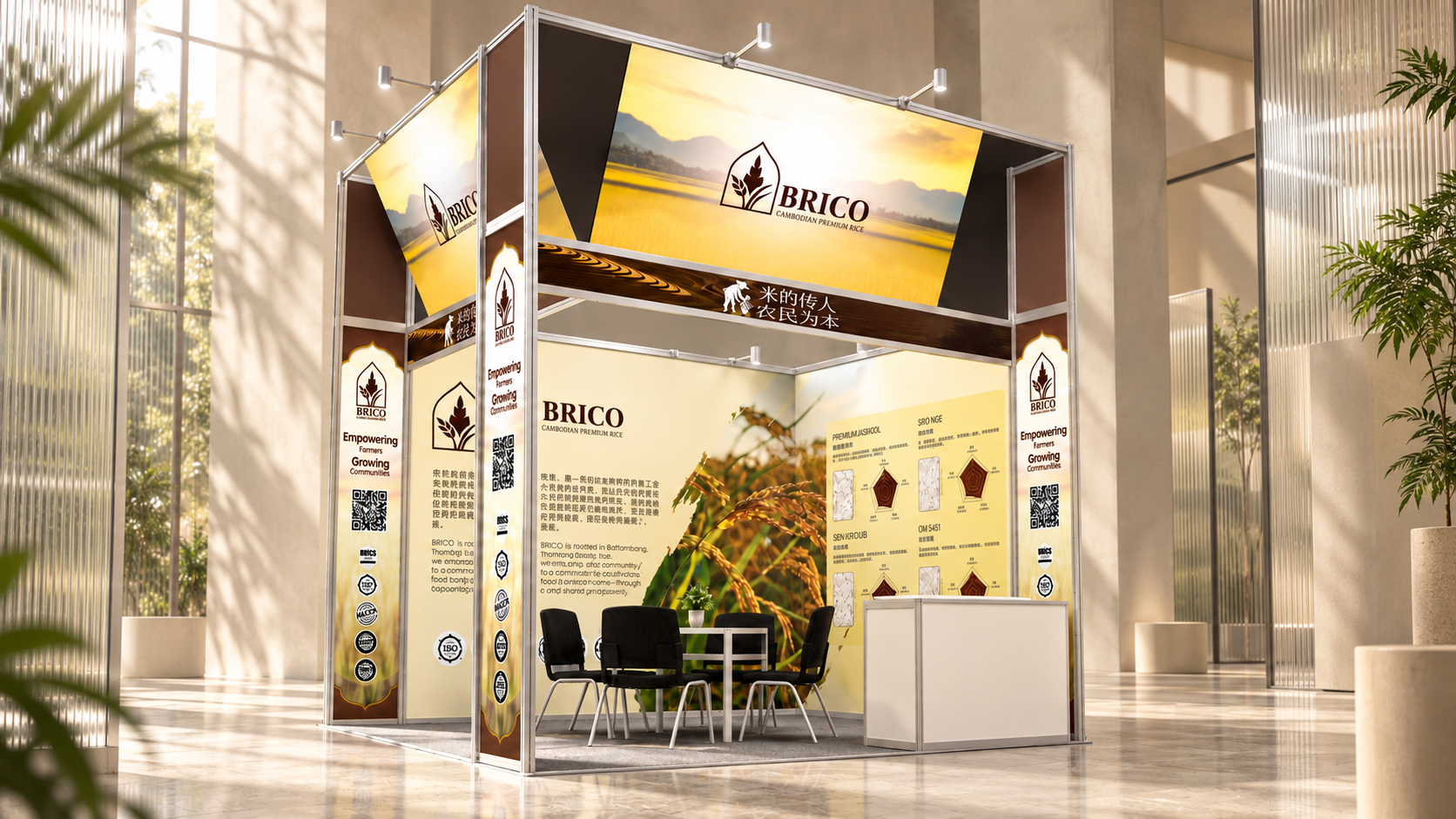
BRICO exhibition concept with cream and gold graphics, product displays and a meeting area in warm natural light.

A welcoming space
for the brand to grow.

BRICO’s identity becomes an inviting exhibition environment through clear sightlines, prominent brand cues and focused product displays. The spatial concept balances visibility with room for conversation, bringing the brand’s quality and character into a personal encounter.

01 / 06

Next project

Mr. Bucket

Have something in mind?

Start a conversation