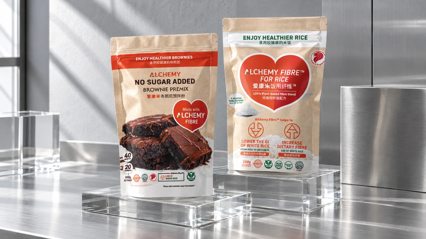
Make the range
recognisable.
Consistent brand marks, product names and food imagery create a relationship between the pouches. Each pack gives its product a clear identity while maintaining a familiar visual structure across the range.
 Start a conversation
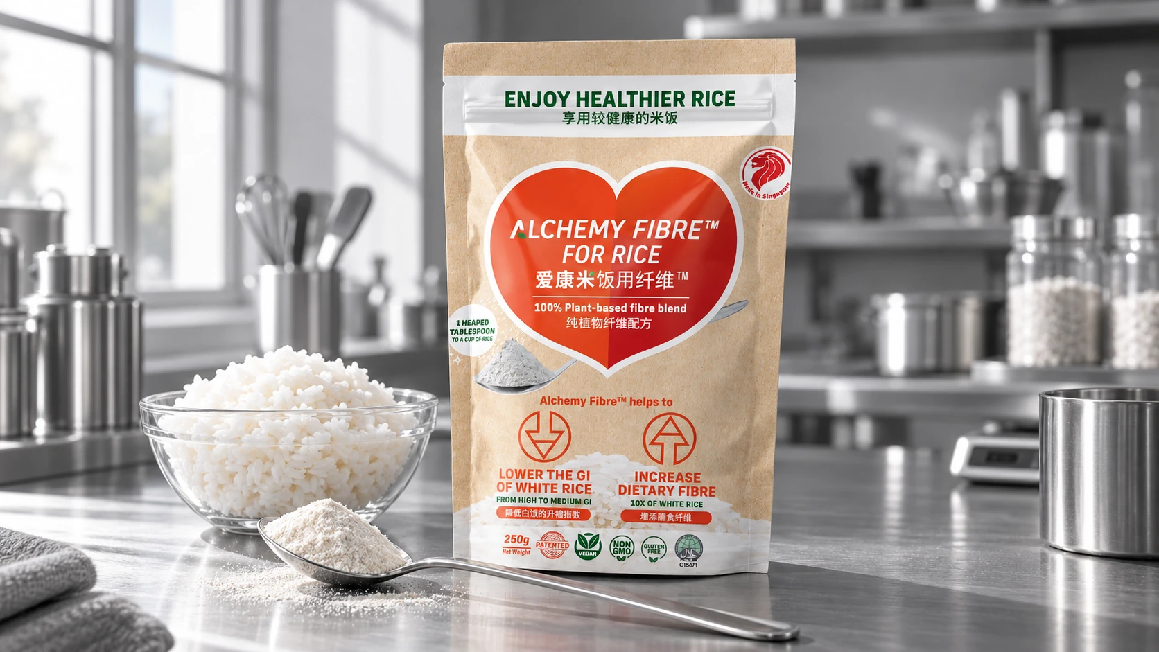
An everyday addition.
Branding, packaging and digital content that connect food innovation with everyday cooking.

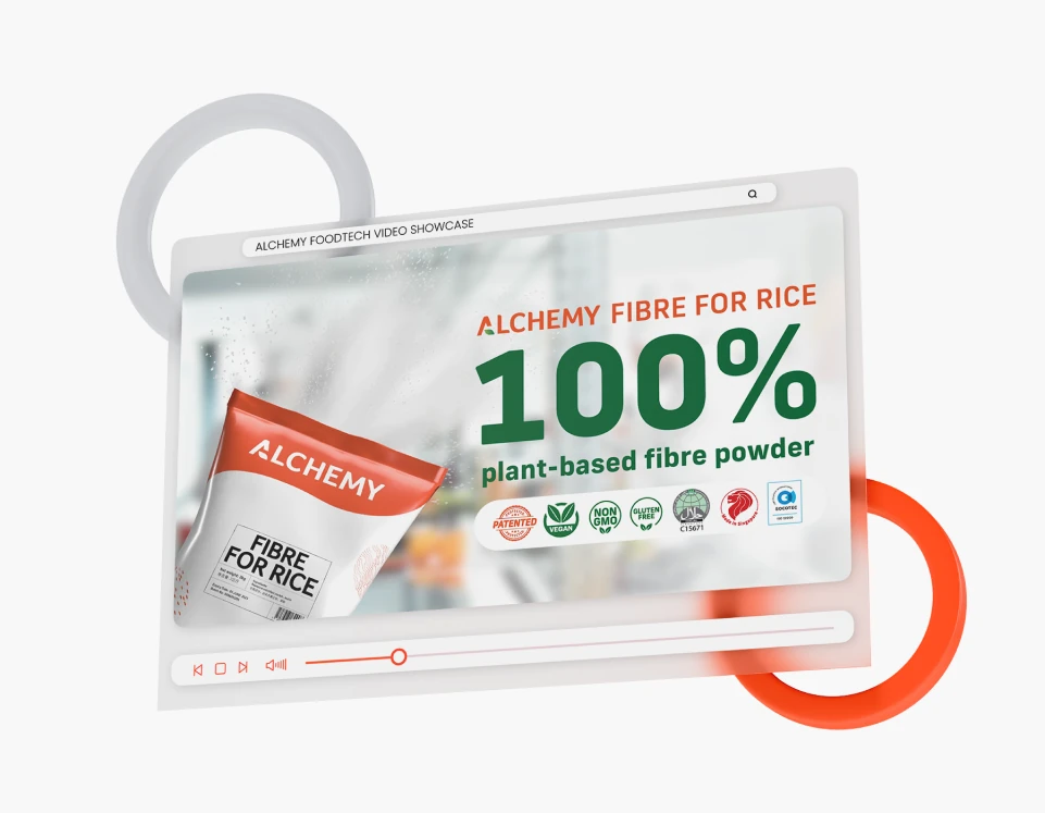


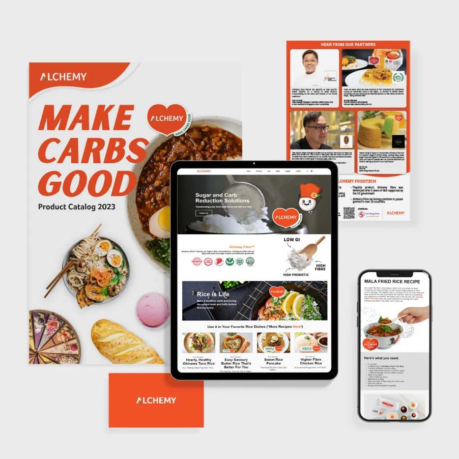
Zepto worked across Alchemy Foodtech’s branding, packaging, website and social content. The design task was to give a food-technology business a clear and approachable presence across the products and communications people encounter.
Warm orange, familiar food imagery and consistent product naming connect the technical story to the kitchen. Packaging introduces the range, while website, brochure and social layouts create space to explain the products and show them in everyday use.
A shared visual language brings packaging, digital experiences and educational content together around the way people cook.
Consistent brand marks, product names and food imagery create a relationship between the pouches. Each pack gives its product a clear identity while maintaining a familiar visual structure across the range.
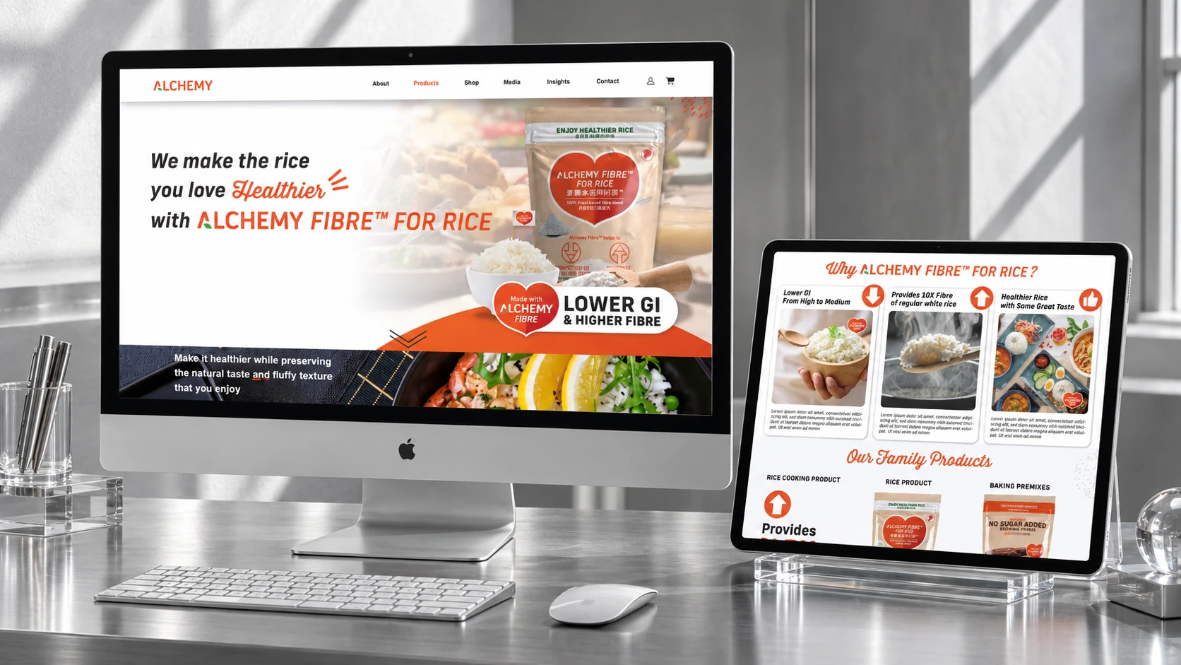
The website pairs product information with food imagery and practical usage content. Clear sections guide the story from an introduction to the range through to the ways it can fit into everyday cooking.

Recipe content and partner stories give the brand a more personal voice. A consistent visual treatment connects food-led posts with interview content while allowing each subject to remain the focus.
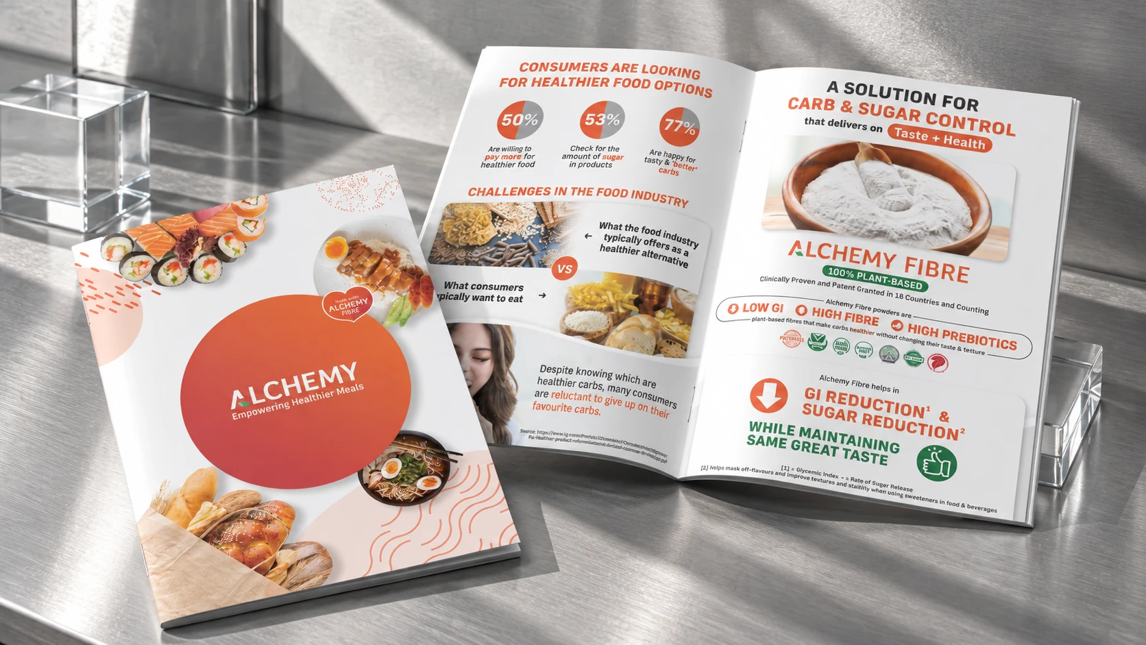
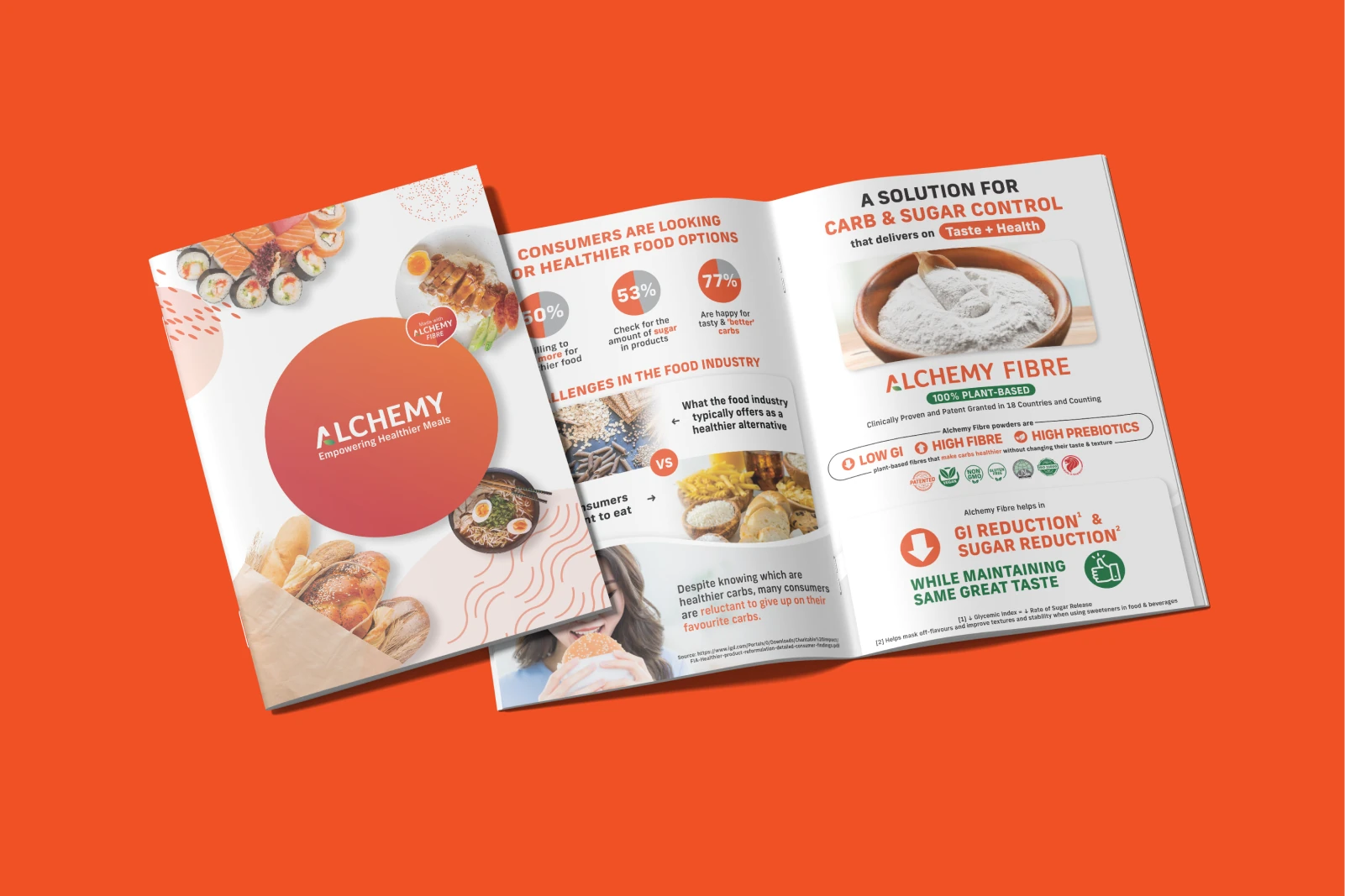
The brochure brings the product story into a structured print format. Clear headings, diagrams and food imagery organise the information into sections that can be explored at a reader’s own pace.
Have something in mind?
Start a conversation